


Presentation is one of the most important aspects of showcasing art.
It seems obvious to say; but it is incredibly common to see descriptions on Art Portal submissions featuring lines like "Sorry for the bad picture" or "it looks much better in person." This can be unavoidable, depending on the materials used (metallic/glossier finishes in particular can be difficult), and the quality of the camera you have access to, but there's still a lot that can be done to improve your documentation and presentation quality.
I've been documenting my traditional art here on Newgrounds for 13 years now, and have learned a lot about the best ways to document art; while working around various limitations, including suboptimal cameras, large canvases, poor lighting, and less than ideal captured images to work with in post. Successful documentation of Traditional Art can be the difference between a high score and low score here on Newgrounds; it can be the difference between getting your piece Frontpaged or not; it can be the deciding factor for getting new Follower/fan, a sold piece of art, or a commission out in the world. It is an essential part of existing as a traditional artist online.
On to the guide!
Camera
Currently I use my phone's camera (iPhone 7S), it's perfectly acceptable and can capture images at a high enough quality for the purposes of sharing on the internet. I started with an iPhone 3GS, which was much worse at everything, but still was very much able to take workable pictures of art in controlled environments, so even if you're working with an older, or more budget model camera phone, there's a lot you can do to take better pictures beyond just getting a better camera.
For the settings on your camera phone, make sure to turn the photo grid ON. This will allow you to better line up the edges of your Art, so you're not taking an off-axis shot, which will warp and skew the dimensions of the Art, and result in the need for image rotation and angle adjustments, as well as more cropping into your edges in the image editor. The more gridlines you can add the better, accuracy is extremely important in getting the best documentation you can.
I don't know if other phones have this, and I can't find the name for it in settings, it seems to be a standard feature but the iPhone has a little crosshair when held perpendicular to the floor, that aligns as you get more perfectly parallel, look for that setting if you have a different phone, and pay attention to it if you're using an iPhone.
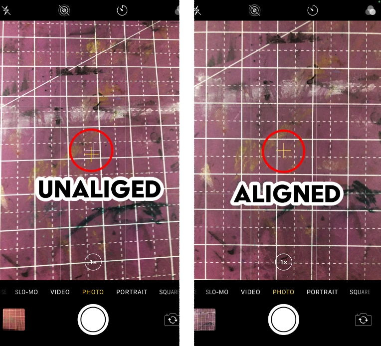
Admittedly I probably should have taken this above a surface that wasn't also a white grid, oh well.
Depending on how deep into the nitty gritty your phone allows you to get into your photo settings, make sure to set the settings as high as possible, as a general rule. There may be some circumstances where a middle quality may be perfectly adequate, especially with newer phone's that have more out-there high-quality cameras. If you're primarily taking color photos, do be sure HDR is on if available. For black and white art, it might get in the way a bit more depending on your lighting set up, but in general keeping it on isn't going to break anything, it just might pick up more color subtleties than you need/want.
All this being said, if you have access to a better camera, it's best to use that, even if it's less convenient than snapping a shot on your phone, the highest possible quality is always the best. I can't speak to the ideal settings and lenses on fancier cameras, but if you've got a fancy camera, chances are you'd know better than me what settings/equipment to use anyway.
LIGHTING
Lighting is going to be the single most important aspect of this whole guide, and is going to be the make or break factor in what makes a solid showcase, and what makes a lacking showcase. Good lighting is not something that is universally accessible to everyone all the time, but it is important to do your best to make the absolute best lighting circumstances possible, even if it means waiting a while to get those circumstances.
In general you want consistent, indirect, white light, for documenting art. Overhead lighting fixtures are not great for this, as they often will create glare, and brighter spots on the parts directly under the bulb(s). Home lighting is often a softer, yellow light that may alter the colors a bit, or be duller than white light, if it's all you have to work with, it is certainly able to get decent enough lighting. You may need to move around a few lamps to get an even distribution of light, or get some weird setups to get enough ambient light, but enough experimentation should get you bettwer results than a basic overhead light fixture. Bathrooms and kitchens will often have better lighting, so it may be worth it to try those rooms if possible.
I'm using an illustration of mine from 2018 to demonstrate, because it is 11" X 17" a difficult size to get even lighting, and it has a large value and color range, so it's a good test of effective lighting and photo setups.
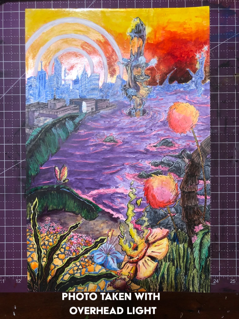
Note the intense glare, and how washed out most of the colors are, as well as how dim the bottom of the piece gets. This is taken with just my overhead ceiling light, no special considerations made. I would have to be working around this glare and find a spot far enough away to have no glare, but close enough to have enough light.
Suboptimal setup.
Outside is one of the best ways to document art (weather permitting). On a sunny day, go to an evenly shaded area, lay your art on a flat surface and take your picture. Photographing in direct sunlight can potentially wash out your colors, or create glare, lose some detail by blowing out your cameras sensors; If the day is suitably bright, you should have no problem taking the photo in the shade, and you'll be ready to go to the editing (I advise taking a drawing board and taping the paper to it, so the paper doesn't blow away, or get damaged in anyway).
On an overcast day, the lighting should be relatively even wherever, so its even easier, just make sure your shadow isn't on the picture, when cleaning up photos in post, even subtle shadows tend to get very noticeable as the image is adjusted.
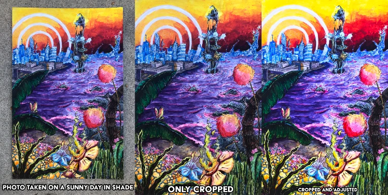
I should have put it on a board and tapped it down to avoid the edges curling up, and so it wasn't on the ground, but I was in a rush to catch the daylight. Note, how little adjustment needed to be made, between cropping and adjusting though. It did come out a bit darker in the tones, and the warmer areas came out cooler, but it can be adjusted well with a bit more involved tweaking, but it didn't really bother me.
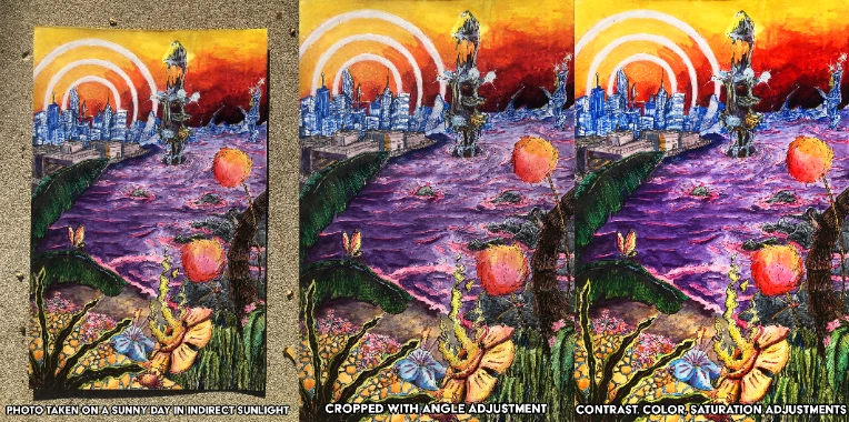
Admittedly, while I did take these in the sun, the sun was setting so this actually ended up looking really good. Since the sunlight wasn't as intense as if it were earlier in the afternoon there wasn't any glare, and there wasn't much blowout in the colors. The purple of the water was a little washed out, but with some light editing that came to look much more saturated and worked really well. Especially considering the other colors used on this piece, the warmer light definitely suited it better. But I will say photographing in the shade under most circumstances is going to get you more predictable and reliable results, but if you can time it to get some indirect sunlight just as it's going down, but not quite low enough to reflect at a harsh angle, I'm gonna say that's the best outdoor setup.
My standard method of art documentation is much more streamlined as of a few years ago. I bought two LED panels, maybe $20 each, and they were a complete game changer. They turned a potentially fifteen minute process of getting a good enough photo, into a maybe five minute process with much more consistent and better results (especially with larger illustrations). Set up is easy and also great for drawing in general: put the two panels up equidistant on either side of the drawing (about two feet or so should be good, face them towards the art, but also up and away, so there's no direct light on the page (if you're in the drawing process this is less important). Make sure the lighting is even, turn off any other lightsources besides the two LED panels and take your picture. I also have a large gridded cutting mat I use on my desk, which is just good to have in general, but also helps line up your photo along with your phone's gridlines. If you post a lot of Traditional Art, I would say two LED Panels such as the ones I have are a must-buy.
Photo taken with LED setup:
As you can see using the LED setup, works great, the accuracy of the unedited piece is almost identical to how it appears in person. The adjustments made are very minimal, and even if I left it unadjusted it would still be very accurate, really just small contrast adjustments were needed.
Honestly, all three of these tests have come out better than my initial photo of this piece, so keep at it! You improve most by constantly working and iterating your techniques.
Photographing Technique
So you have your camera set up, you have your best possible lighting conditions, now you need to actually take the photo, or photos in this case. Even with all the years of practice, and streamlined process I've created over documenting a thousand or so pieces of art, I still always take at least three photos, often more just out of habit. This isn't film, and the subject of the photo isn't going anywhere, take a few photos and review them. Make sure the colors look good in the lighting, make sure the edges are all square with the frame, make sure there's no smudges on your lens that makes some spots blurry; it kills me every time I rush it, and sit down and see something is wrong with my photo, and I have to set it all back up again.
As you are taking your photos alter your angles a bit, sometimes it feels like you're dead-on, but your off axis a bit so having a bunch of slightly different angles will give you a better chance of the perfect shot. Also leave at least about a relative inch or two of border space around the whole shot; this will allow you to rotate the image slightly without cutting off the corners or edges of your piece. Often the edges aren't perfectly parallel, but it's otherwise a great picture, and the very edge can be cut off a little without ruining the composition, this is fine to do, and does not warrant retaking all the pictures. You begin to grow a sense for what is an acceptable loss.
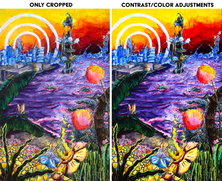
Fix It In Post
Not all photo editing software is created equally. Someone with Photoshop is going to have a lot more options than somebody working with Windows Photo Viewer, or default phone software. However, from my experience even the most basic modern photo editing software can enhance a well documented art piece. The main tools you need to worry about are, Rotate, angle adjust, Crop, Lighting/Brightness, Contrast, and Saturation -- provided you were able to take an optimal photograph.
Kind of obvious, but first step, is rotate the image to be right-side-up -> then adjust the angle to correct any minor offsets that may be present -> Crop the image to the edges of the art piece
(***Side note, sometimes you may want a border around the illustration, if you've drawn this into your original drawing, it's better to still crop to the edges of the area of the drawing itself and crop out your border, and then as a final step re-add the border by increasing the canvas size with a white fill, often the paper will bow, or some other imperfection will cause the border to look less than perfectly square, making it look a bit sloppy***)
-> Adjust the lighting, until your whites are the appropriate brightness -> the contrast until your value range is suitable, (if "black point" and "shadow adjustments are present use those as well to bring out the the darker range) -> Adjust the saturation, until the colors are looking suitably rich and comparable to what you see in person (**some colors just don't photograph super well, so if you're using a more robust photo editor it may be worth it to get more into color channel editors and pull those out more, but that is a bit beyond the scope of this guide as it is**).
As you adjust these settings, be sure to go back and balance them out. Adjusting the contrast may have made the brightness look a bit wonky and you may want to pull that back, or push it further, just work with it all a bit as you go, each drawing is different.
Some Side Notes
On the question of how much editing is too much editing: I would say if you're looking to sell the original art, keep it as close to real life as possible, you're not just showcasing art, you're selling a product. If it's just for you, go crazy, push the contrast, lighting, change colors wholesale, think that pink would be better than blue for a character's hair? if you've got the right program try it out. But be mindful that filters, unless used carefully can look garish over hand drawn art; as can digitally drawn effects and backgrounds if you don't know what you're doing.
DO NOT have anything else in the image. A lot of social media Traditional Artists will have some of the utensils they used in the documenting photo of their art. Don't do this, maybe for instagram it works, but for any actual showcasing and documenting, just have the art. A pen or pencil, or brush, or whatever, in the picture can throw off the composition, hide parts of the piece, and/or draw the eye's attention to them since they're real objects and not part of the art. Additionally I tend to see the "materials/tools in shot" mixed with the added nonsense of an angled shot to show more of the work space, needless to say this is also bad, and warps all of the proportion of your art, don't do it. Another less intrusive thing to look out for is the spiral binding of a sketchbook being in the shot. While not as bad or distracting as utensils in frame, the micro perforation and large metal spiral can throw off the balance of the piece, as well as just look a bit sloppy. I don't see this sort of thing super often here on Newgrounds, or in any listings, but when it does pop up it is immediately noticeable in a bad way. Beyond all the aforementioned reasons listed, it is tacky, and looks a lot more "Live, Laugh, Love" than "I'm a traditional artist."
AND THAT'S THE GUIDE!
Thank you for reading, I hope this can be of use to you in your future art documenting! If you have any of your own tricks to art documentation, including camera settings for other phones, apps, software, techniques etc. please comment below, and I'll try them out and add them to the list.
If you are having trouble or can't quite figure out how to document your art, or have some unique problem, let me know, in the comments or Private Message and I can do my best to help you out. Or if you have a picture of your art that you can't quite figure out how to improve in post correctly send it to me and I can try to iron it out a bit.
WVDB
You are a saint.