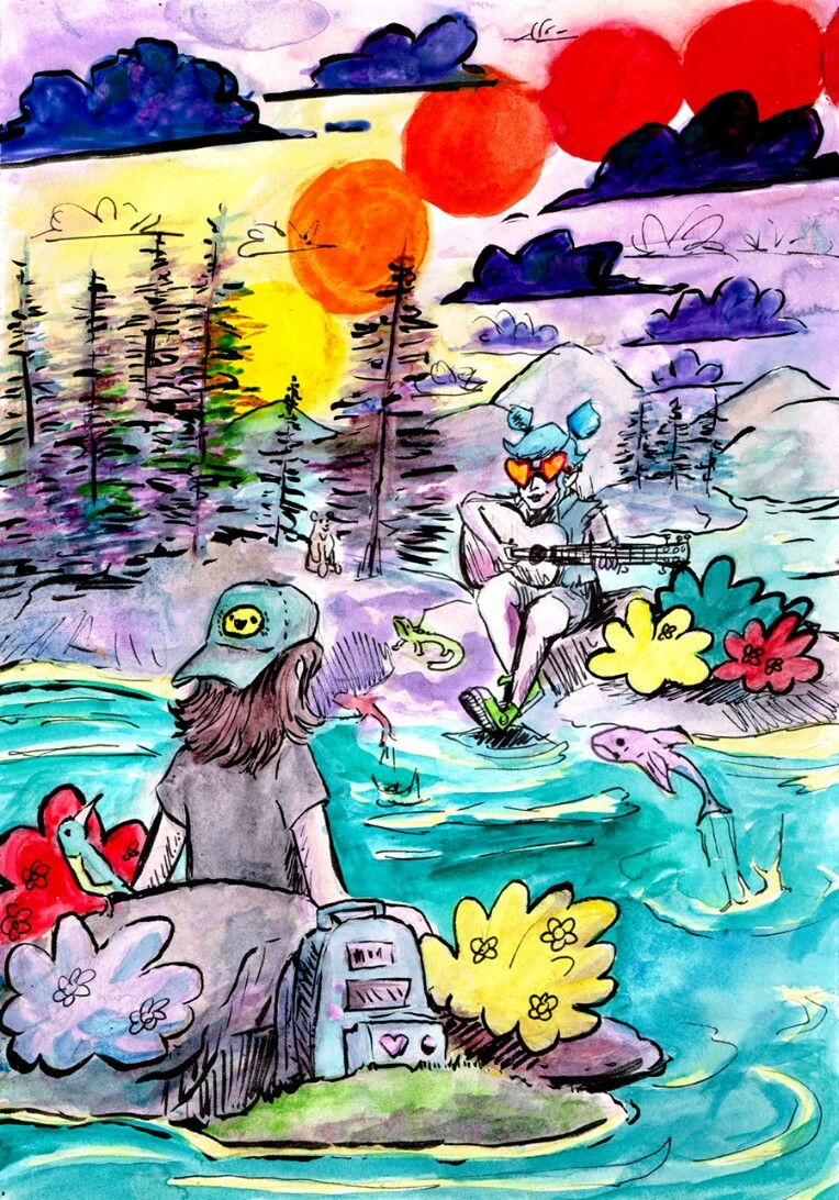
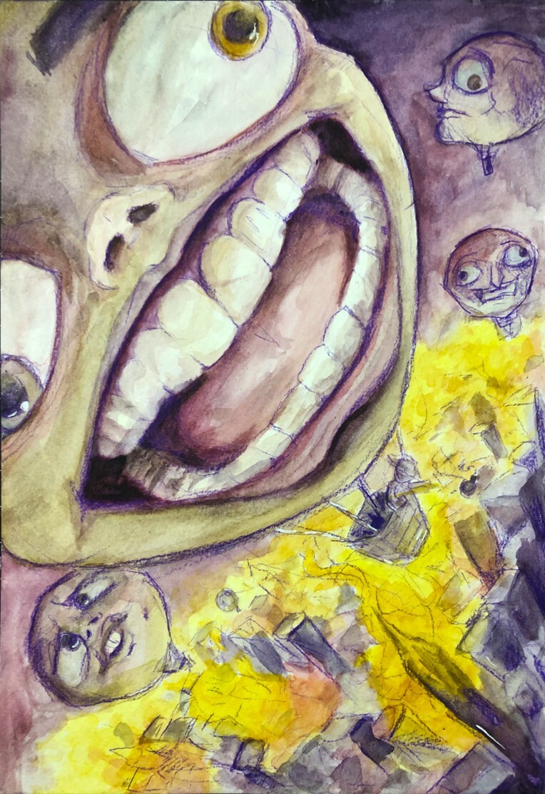
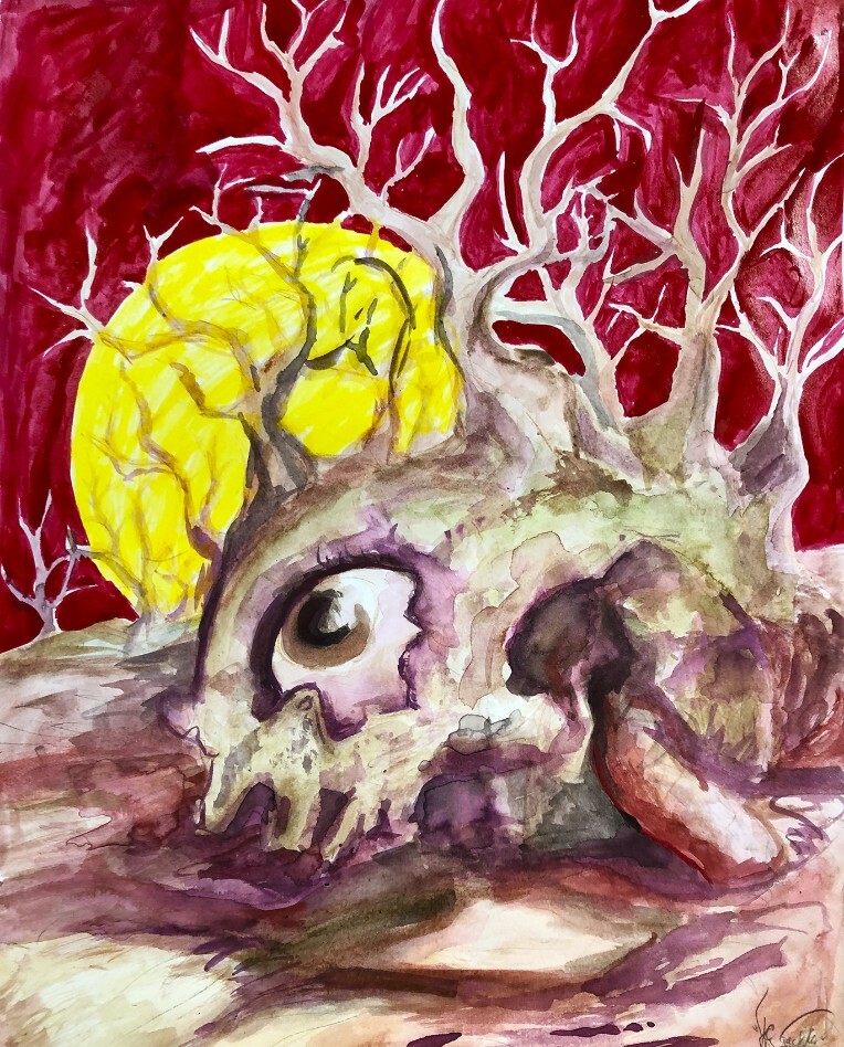
00:00
00:00
SourCherryJack
Yeah, something like that.

Jack @SourCherryJack

Age 29

Artist

Kool Skool

Los Angeles

Joined on 8/11/09

Level:
28
Exp Points:
8,690 / 8,700
Exp Rank:
4,455
Vote Power:
7.01 votes
Art Scouts
5
Rank:
Civilian
Global Rank:
> 100,000
Blams:
1
Saves:
27
B/P Bonus:
0%
Whistle:
Silver
Trophies:
8
Medals:
136
Supporter:
9y 8m 6d
Gear:
1

SourCherryJack's News

Posted by SourCherryJack - April 6th, 2023


Hello, for those of you that didn't know I stream art/illustration/paintings on my Twitch Channel every so often, in 2021 I streamed a drawing everyday on it, which is when a majority of you probably started seeing me pop up in the Art Portal more often... because I posted every day. Anyway, I'm not quite up to daily streams, and I'm not finishing a new drawing every day, but I am resuming some regular, consistent, casual streaming over there

So far I'm usually on between the hours of 6:00am and 8:00am California time, and/or 5:00pm - 8:00pm California time.

iu_941678_2960153.webp


Over on the Art Stream I draw and talk about whatever is going on, either in the world at large, or just in my day-to-day life, I try to tell some fun stories from my life, and talk about other random stuff that's just on the mind. I can also provide live critiques for any of you artists out there who may want some feedback on your work. I will try to host more NG Art Forum related 'event streams' like the two Art Whore [request] Threads I streamed a while back (LINK 1 LINK 2). What other forms this may take, I do not know yet, but I have been meaning to do some OC redraws from The OC Plaza Thread over in the Art Forum.


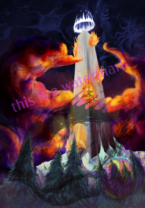
Lately, and for the next few streams I'll be chipping away at a commissioned Tarot Deck. It's a digital project, so that's kinda novel from me, if that interests you, come hang out!

Here's The Tower Card, the most recent one I finished, but there's a lot to go still.

iu_941679_2960153.jpg

Have a good weekend, hope to see you in there!


Tags:

11

Posted by SourCherryJack - November 16th, 2022


Presentation is one of the most important aspects of showcasing art.

It seems obvious to say; but it is incredibly frequent to see descriptions on Art Portal submissions featuring lines like "Sorry for the bad picture" or "it looks much better in person." This can be unavoidable, depending on the materials used (metallic/glossier finishes in particular can be difficult), and the quality of the camera you have access to, but there's still a lot that can be done to improve your documentation and presentation quality.

I've been documenting my traditional art here on Newgrounds for 13 years now, and have learned a lot about the best ways to document art; while working around various limitations, including suboptimal cameras, large canvases, poor lighting, and less than ideal captured images to work with in post. Successful documentation of Traditional Art can be the difference between a high score and low score here on Newgrounds; it can be the difference between getting your piece Frontpaged or not; it can be the deciding factor for getting new Follower/fan, a sold piece of art, or a commission out in the world. It is an essential part of existing as a traditional artist online.

On to the guide!


Camera

Currently I use my phone's camera (iPhone 7S), it's perfectly acceptable and can capture images at a high enough quality for the purposes of sharing on the internet. I started with an iPhone 3GS, which was much worse at everything, but still was very much able to take workable pictures of art in controlled environments, so even if you're working with an older, or more budget model camera phone, there's a lot you can do to take better pictures beyond just getting a better camera.

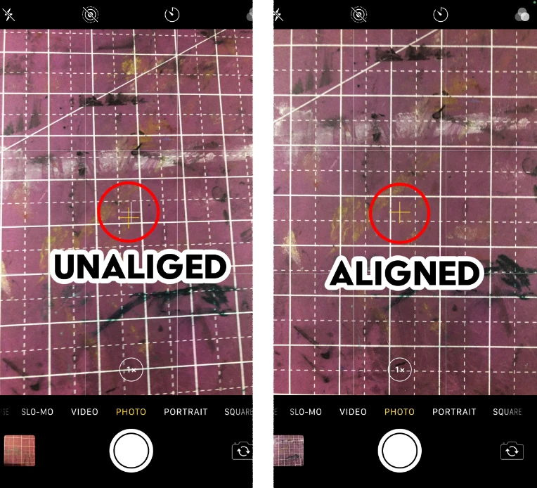
For the settings on your camera phone, make sure to turn the photo grid ON. This will allow you to better line up the edges of your Art, so you're not taking an off-axis shot, which will warp and skew the dimensions of the Art, and result in the need for image rotation and angle adjustments, as well as more cropping into your edges in the image editor. The more gridlines you can add the better, accuracy is extremely important in getting the best documentation you can.

I don't know if other phones have this, and I can't find the name for it in settings, it seems to be a standard feature but the iPhone has a little crosshair when held perpendicular to the floor, that aligns as you get more perfectly parallel, look for that setting if you have a different phone, and pay attention to it if you're using an iPhone.

iu_806070_2960153.webp

Admittedly I probably should have taken this above a surface that wasn't also a white grid, oh well.


Depending on how deep into the nitty gritty your phone allows you to get into your photo settings, make sure to set the settings as high as possible, as a general rule. There may be some circumstances where a middle quality may be perfectly adequate, especially with newer phone's that have more out-there high-quality cameras. If you're primarily taking color photos, do be sure HDR is on if available. For black and white art, it might get in the way a bit more depending on your lighting set up, but in general keeping it on isn't going to break anything, it just might pick up more color subtleties than you need/want.

All this being said, if you have access to a better camera, it's best to use that, even if it's less convenient than snapping a shot on your phone, the highest possible quality is always the best. I can't speak to the ideal settings and lenses on fancier cameras, but if you've got a fancy camera, chances are you'd know better than me what settings/equipment to use anyway.


LIGHTING

Lighting is going to be the single most important aspect of this whole guide, and is going to be the make or break factor in what makes a solid showcase, and what makes a lacking showcase. Good lighting is not something that is universally accessible to everyone all the time, but it is important to do your best to make the absolute best lighting circumstances possible, even if it means waiting a while to get those circumstances.

In general you want consistent, indirect, white light, for documenting art. Overhead lighting fixtures are not great for this, as they often will create glare, and brighter spots on the parts directly under the bulb(s). Home lighting is often a softer, yellow light that may alter the colors a bit, or be duller than white light, if it's all you have to work with, it is certainly able to get decent enough lighting. You may need to move around a few lamps to get an even distribution of light, or get some weird setups to get enough ambient light, but enough experimentation should get you bettwer results than a basic overhead light fixture. Bathrooms and kitchens will often have better lighting, so it may be worth it to try those rooms if possible.


I'm using an illustration of mine from 2018 to demonstrate, because it is 11" X 17" a difficult size to get even lighting, and it has a large value and color range, so it's a good test of effective lighting and photo setups.

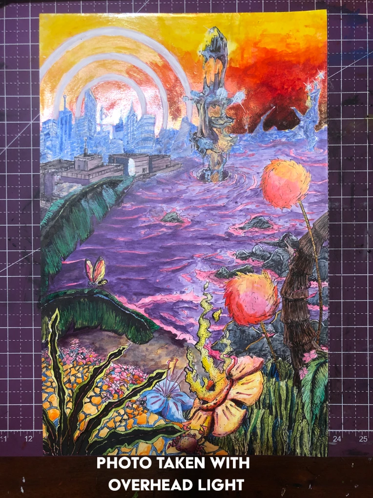
iu_806071_2960153.webp

Note the intense glare, and how washed out most of the colors are, as well as how dim the bottom of the piece gets. This is taken with just my overhead ceiling light, no special considerations made. I would have to be working around this glare and find a spot far enough away to have no glare, but close enough to have enough light.
Suboptimal setup.


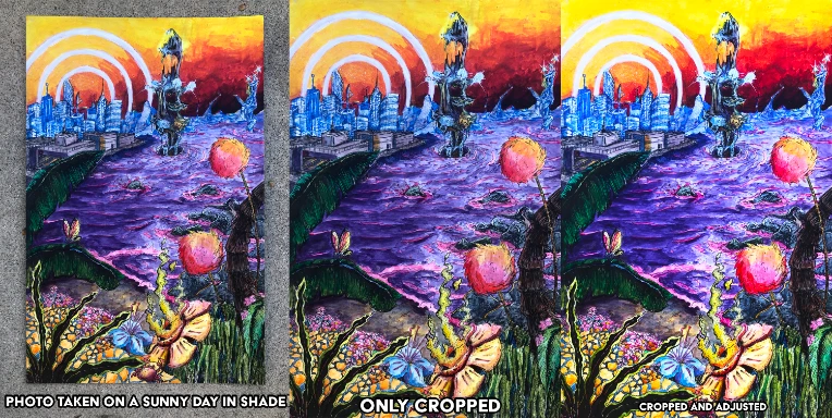
Outside is one of the best ways to document art (weather permitting). On a sunny day, go to an evenly shaded area, lay your art on a flat surface and take your picture. Photographing in direct sunlight can potentially wash out your colors, or create glare, lose some detail by blowing out your cameras sensors; If the day is suitably bright, you should have no problem taking the photo in the shade, and you'll be ready to go to the editing (I advise taking a drawing board and taping the paper to it, so the paper doesn't blow away, or get damaged in anyway).

On an overcast day, the lighting should be relatively even wherever, so its even easier, just make sure your shadow isn't on the picture, when cleaning up photos in post, even subtle shadows tend to get very noticeable as the image is adjusted.


iu_806072_2960153.webp

I should have put it on a board and tapped it down to avoid the edges curling up, and so it wasn't on the ground, but I was in a rush to catch the daylight. Note, how little adjustment needed to be made, between cropping and adjusting though. It did come out a bit darker in the tones, and the warmer areas came out cooler, but it can be adjusted well with a bit more involved tweaking, but it didn't really bother me.


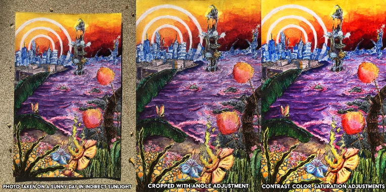
iu_806073_2960153.webp

Admittedly, while I did take these in the sun, the sun was setting so this actually ended up looking really good. Since the sunlight wasn't as intense as if it were earlier in the afternoon there wasn't any glare, and there wasn't much blowout in the colors. The purple of the water was a little washed out, but with some light editing that came to look much more saturated and worked really well. Especially considering the other colors used on this piece, the warmer light definitely suited it better. But I will say photographing in the shade under most circumstances is going to get you more predictable and reliable results, but if you can time it to get some indirect sunlight just as it's going down, but not quite low enough to reflect at a harsh angle, I'm gonna say that's the best outdoor setup.


My standard method of art documentation is much more streamlined as of a few years ago. I bought two LED panels, maybe $20 each, and they were a complete game changer. They turned a potentially fifteen minute process of getting a good enough photo, into a maybe five minute process with much more consistent and better results (especially with larger illustrations). Set up is easy and also great for drawing in general: put the two panels up equidistant on either side of the drawing (about two feet or so should be good, face them towards the art, but also up and away, so there's no direct light on the page (if you're in the drawing process this is less important). Make sure the lighting is even, turn off any other lightsources besides the two LED panels and take your picture. I also have a large gridded cutting mat I use on my desk, which is just good to have in general, but also helps line up your photo along with your phone's gridlines. If you post a lot of Traditional Art, I would say two LED Panels such as the ones I have are a must-buy.

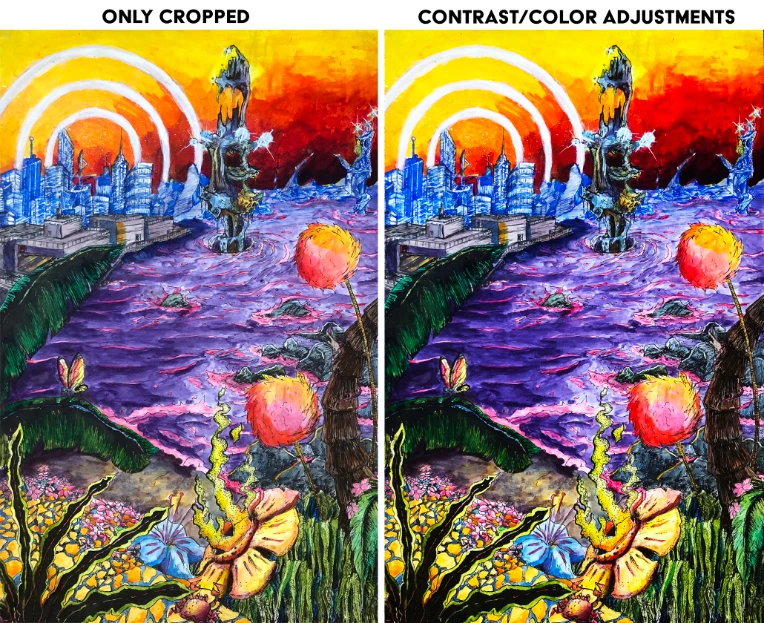
Photo taken with LED setup:

iu_806074_2960153.webp

As you can see using the LED setup, works great, the accuracy of the unedited piece is almost identical to how it appears in person. The adjustments made are very minimal, and even if I left it unadjusted it would still be very accurate, really just small contrast adjustments were needed.
Honestly, all three of these tests have come out better than my initial photo of this piece, so keep at it! You improve most by constantly working and iterating your techniques.


Photographing Technique

So you have your camera set up, you have your best possible lighting conditions, now you need to actually take the photo, or photos in this case. Even with all the years of practice, and streamlined process I've created over documenting a thousand or so pieces of art, I still always take at least three photos, often more just out of habit. This isn't film, and the subject of the photo isn't going anywhere, take a few photos and review them. Make sure the colors look good in the lighting, make sure the edges are all square with the frame, make sure there's no smudges on your lens that makes some spots blurry; it kills me every time I rush it, and sit down and see something is wrong with my photo, and I have to set it all back up again.

As you are taking your photos alter your angles a bit, sometimes it feels like you're dead-on, but your off axis a bit so having a bunch of slightly different angles will give you a better chance of the perfect shot. Also leave at least about a relative inch or two of border space around the whole shot; this will allow you to rotate the image slightly without cutting off the corners or edges of your piece. Often the edges aren't perfectly parallel, but it's otherwise a great picture, and the very edge can be cut off a little without ruining the composition, this is fine to do, and does not warrant retaking all the pictures. You begin to grow a sense for what is an acceptable loss.


Fix It In Post

Not all photo editing software is created equally. Someone with Photoshop is going to have a lot more options than somebody working with Windows Photo Viewer, or default phone software. However, from my experience even the most basic modern photo editing software can enhance a well documented art piece. The main tools you need to worry about are, Rotate, angle adjust, Crop, Lighting/Brightness, Contrast, and Saturation -- provided you were able to take an optimal photograph.

Kind of obvious, but first step, is rotate the image to be right-side-up -> then adjust the angle to correct any minor offsets that may be present -> Crop the image to the edges of the art piece

(***Side note, sometimes you may want a border around the illustration, if you've drawn this into your original drawing, it's better to still crop to the edges of the area of the drawing itself and crop out your border, and then as a final step re-add the border by increasing the canvas size with a white fill, often the paper will bow, or some other imperfection will cause the border to look less than perfectly square, making it look a bit sloppy***)

-> Adjust the lighting, until your whites are the appropriate brightness -> the contrast until your value range is suitable, (if "black point" and "shadow adjustments are present use those as well to bring out the the darker range) -> Adjust the saturation, until the colors are looking suitably rich and comparable to what you see in person (**some colors just don't photograph super well, so if you're using a more robust photo editor it may be worth it to get more into color channel editors and pull those out more, but that is a bit beyond the scope of this guide as it is**).

As you adjust these settings, be sure to go back and balance them out. Adjusting the contrast may have made the brightness look a bit wonky and you may want to pull that back, or push it further, just work with it all a bit as you go, each drawing is different.


Some Side Notes

On the question of how much editing is too much editing: I would say if you're looking to sell the original art, keep it as close to real life as possible, you're not just showcasing art, you're selling a product. If it's just for you, go crazy, push the contrast, lighting, change colors wholesale, think that pink would be better than blue for a character's hair? if you've got the right program try it out. But be mindful that filters, unless used carefully can look garish over hand drawn art; as can digitally drawn effects and backgrounds if you don't know what you're doing.


DO NOT have anything else in the image. A lot of social media Traditional Artists will have some of the utensils they used in the documenting photo of their art. Don't do this, maybe for instagram it works, but for any actual showcasing and documenting, just have the art. A pen or pencil, or brush, or whatever, in the picture can throw off the composition, hide parts of the piece, and/or draw the eye's attention to them since they're real objects and not part of the art. Additionally I tend to see the "materials/tools in shot" mixed with the added nonsense of an angled shot to show more of the work space, needless to say this is also bad, and warps all of the proportion of your art, don't do it. Another less intrusive thing to look out for is the spiral binding of a sketchbook being in the shot. While not as bad or distracting as utensils in frame, the micro perforation and large metal spiral can throw off the balance of the piece, as well as just look a bit sloppy. I don't see this sort of thing super often here on Newgrounds, or in any listings, but when it does pop up it is immediately noticeable in a bad way. Beyond all the aforementioned reasons listed, it is tacky, and looks a lot more "Live, Laugh, Love" than "I'm a traditional artist."


AND THAT'S THE GUIDE!

Thank you for reading, I hope this can be of use to you in your future art documenting! If you have any of your own tricks to art documentation, including camera settings for other phones, apps, software, techniques etc. please comment below, and I'll try them out and add them to the list.

If you are having trouble or can't quite figure out how to document your art, or have some unique problem, let me know, in the comments or Private Message and I can do my best to help you out. Or if you have a picture of your art that you can't quite figure out how to improve in post correctly send it to me and I can try to iron it out a bit.


Tags:

41

Posted by SourCherryJack - June 6th, 2022


So you've found yourself deep in a pit of creative despair.

No matter how hard you try to draw something you keep coming back with nothing, or something that looks like doo-doo. Bummer. The good news is that you're in good company; just about every artist has experienced it, and will experience it again, and again, and again, and so on.


How to get past Art Block is a frequently asked question in the Art Forum here on NG, so I figure I should make a comprehensive answer, to the best of my abilities here, so strap in we're gonna dive deep.


Identify the source of your problem.

This isn't going to be a step by step guide, so much as a flurry of information. Everyone is different, and at different stages of their artists' journey, so the root cause of the block can be any number of sources. The most important way to solve any problem, is to first identify the problem. I admit this may be a bit disjointed, but each section is a common problem, and one that I have personally experienced in some manner, and/or had friends who have experienced these issues. I don't have the data set to determine if these are issues every single artist goes through, but anecdotally speaking, they are very common.


Plateaus

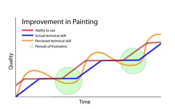
Growth of any skill is very rarely a constant, linear progression of improvement. Often times improvement is going to feel imperceptible from day-to-day; sometimes you may even feel like you're getting worse. Stick it out and keep working, keep learning. Improvement comes with an increased awareness of your own shortcomings. As you get better your ability to read and identify the problem-areas of your art will generally be outpacing your ability to learn and overcome them. You can find a lot of graphs like this one; search google images for "art growth charts" but this one from Marc Dalessio was one I particularly liked
iu_659155_2960153.webp

It is important to remember that (as previously stated!) the first step of solving the problem and -- in this case -- improvement, is identifying your problem(s).


Note in the graph how after a plateau you go from riding the high of noticing how good you're getting to crashing in the doldrums of realizing you've still got a lot to work on? I've been there many times over the past decade, and it is rough, but it is important to remember you're always working to grow.


If you're feeling like your work is in a rut, and looking very same-y; then you need to jump into studies mode (this is going to be repeated a lot in this) and work on learning. Getting into, or returning to fundamentals is always a good place to start. The only way to break out of a plateau is improvement; whether that is targeted studies to grind it out, or just gradually working it out over a longer stretch of time, is up to you, but you're going to have to improve your way out of it.


Switching things up


Maybe your problem isn't with plateauing, your studies are going well, but you're still just not feeling it. Your characters are looking good, but in some way lacking in a way you can't quite put your finger on.

It might be time to switch things up. Work on something way different; if you've been doing character drawings, work on landscapes, if you've been doing fully rendered colored pieces, switch to black and white, and so on.

Beyond just changing what you're drawing, try changing how you're drawing it. Try different mediums, approaches, and techniques. Limit your color pallets, if you've never done a type of art, go for it, take up watercolor, or stencil making, work physical if you're primarily digital, and vice-versa.


Participating in whatever art challenges are floating around on social media can be a good way to motivate yourself to try something new, and feel like you're productively feeding the algorithm gods, while also working in a way that you may not normally.


Personally I found that working in very defined limitations helps me to be a bit more creative to get something done. Whether it was when I first got into digital art, or when I got a 72 pack of Prismacolor markers, I would be spoiled for choice and try to use every tool I had. This is good for studies, to get comfortable with the tools, but to do a full piece and constantly be worrying about the specific color, or brush, or using the best possible color combos, its often overcomplicating matters. When I started really dialing it back and only using a few colors, or brush options for linework and coloring, I started to be able to focus on what I'm drawing and not how I'm drawing it, or how I should be drawing it.


Maintaining Focus

A big issue I see popping up increasingly, and have struggled with myself, is maintaining focus on working. It's very easy to sit and draw for fifteen minutes then get up and take an hour to do busywork. Last year I streamed a drawing every day on twitch to keep me laser-focused. Now, that's an extreme response, but streaming on the internet can be very effective in motivating you to keep working. I found the need to stay on cam, and stay working for the audience (or possibility of someone stopping in on the lower traffic streams) very effective in keeping me at my desk and working.

Another method I use, is put on an album or playlist that I really like, with songs that I will not skip and just throw that on in the Background and full screen my computer. I am not allowed to stop drawing until the playlist or album ends, unless I need to go to the bathroom or get water.

Other effective ways may be to move your work area away from a computer, or phone screen, or if you're a digital artist, disconnect from the internet and put your phone in another room. We are spoiled for distractions and sometimes the best thing you can do is remove yourself from them.

I've had middling success with building a more structured schedule, and trying to pencil in blocks of a day where I'm working on art. It's effective for some friends of mine, but my day-to-day schedule isn't quite rigid enough for that to be super effective with any consistency, and I've never been good at following day planners anyway. It might work for you though so give it a shot!


Strict discipline is going to really help your work ethic, and that may be difficult to achieve, especially considering all the other stuff floating around in our day-to-day lives; it's on you to determine if working on art is your priority, is how you spend your free time, or is eating away at your free time.


Understanding and defining your relationship with art


This is a sort of tangent to beating art block; but I think it's important for beginning and intermediate artists to define what they are hoping to get out of art. If your goal is to become a professional illustrator, it is important to get to work and grind out art block with studies, and just learning to build inspiration from the process of drawing. Whereas if it's a hobby, or something more meditative for you; it would be more healthy to slow it down and take more frequent breaks. Doing studies and building your understanding is still important, but art block shouldn't be seen as a huge issue that must be overcome at the expense of your peace of mind, you can afford to wait for inspiration to strike.

One of the major issues with the modern hellscape we operate in is, unfortunately, the commodification of hobbies. Hustle culture has, for many, broken the idea that anything can just be for the one person doing it. If you're not trying to be a career artist, it may be worth it to take a step back, take a break for a bit. If not from art, from sharing your art on the internet. The pressures of constant comparison to other artists, whether it's in terms of skill, or follower counts, or any other measure of perceived success, can be too much a lot of the time. Taking extended breaks, and declaring you are on a break may be the most healthy option since it removes the self-expectation.


Don't Be Precious With Your Art

added 6/8/22

It is important to take pride in your work, and in your progress as an artist, I just want to lead with that in this section. However, one can become precious with their work, and this can potentially lead to situations where an artist is hung up on one piece, or a current style, or design approach. It is easy to want a piece to look perfect, to get every detail down and really lose oneself in the drawing; but at some point all that time and work may turn into overworking the piece, or turn into the fear that you'll ruin it, or go into a state of constant revisions. The reality might be that it's time to move on to a new drawing, or dial it back a bit and be a bit looser on a smaller project, or even abandon it all together and find a new approach.

I've come to the conclusion as I've learned art, that a series of quicker messier drawings, all improving in tiny increments, that were done fairly quickly; while not as visually impressive on-the-whole as a single piece I've spent days and days and days on, have been better in improving my skills as an illustrator. I don't remember them as much as the big monoliths, but the little black and white, or two-tone sketches in the sketchbooks are where the bulk of your time learning, and making art will take place, and its where the true sparks of creativity appear, so don't neglect them.

Creating a monolith of an art piece that dominates every thought, and moment of your available work time, can end up pushing you to not want to work at all; it can be totally paralyzing. I have personal experience with a large commission that ate away at me to the point where I wouldn't even set up any art equipment because I didn't want to think about it. Eventually I went with scrap the work and find a new approach and it worked out, but it was an iffy few months.


The same situation can happen if you allow a perfectionist mindset to set in and have a vision that your current skill level cannot execute. If you adhere too much to this vision, you can demoralize yourself and not want to work on it, or anything in the future, because it's not going to be what you envision.

A somewhat janky drawing that falls short of your expectations is better for you, and your progress as an artist, than no drawing at all.


The Weight of Social Media and Algorithm Chasing

The social media landscape is completely and utterly unsustainable for artists. That is the truth, that is a fact. The demands of the various algorithms' hunger for 'content' is not something that artists were built to be able to keep up with. If you feel discouraged from drawing by lack of 'likes' 'follows' re-tweets etc. I can't blame you. It does feel good to get that reward of 'high engagement' on something you work really hard on; and it sucks when you put something out there that flops in engagement. That is the truth.

Chasing feedback, or an audience is difficult, and (for me) can feel gross, but it is a reality. And low empirical returns can be demoralizing. The only way out of it, is to either get a huge following and begin to get the dopamine drip of being internet famous; or to put less value on the feedback of social media. One is definitely easier to approach than the other.

I find a lot of internet artist communities can feel largely impenetrable, especially for already small accounts; but try to reach out to other small artists that share your interests, this can help to build a symbiotic community of solid feedback, and keep you all working on art. You may not rake in thousands of likes, but you can pull in some real feedback, that is more valuable. And from these connections you can push yourself to do some collaborations, art trades, or joint ventures on larger art projects. While it's not perfect, the Art Forum here on Newgrounds can be a good place to start and get targeted feedback on your art.


Finding Inspiration in the Process


I am not a scholar of psychology, and have not done much reading into the source of inspiration so this is by no means comprehensive, but I do have experience in having art block and working through it. I don't think I am alone in the feeling that after long spells of not working on art, the most daunting task feels like getting the ball rolling on it and starting a piece, sketches, or explorations. It isn't every time, but often once I sit down and start sketching, the ideas start to flow a bit easier after like half an hour, and the days after it's not as challenging to start. As you build the habit of drawing regularly, it becomes easier. I have been in situations where I didn't want to start drawing because I didn't have a few hours and didn't want to be interrupted. This is a bad perspective to have; if I had taken the twenty minutes here and there that I had, every time they'd pop up I could have gotten a lot of sketching done, and potentially expanded some ideas or chipped away at work. Instead I opted for sitting around watching a youtube video I've long since forgotten about.

This isn't to say that you gotta do a lot every day, but getting a little bit of sketchbook time in every day is great way to remind yourself that you don't need ideal circumstances to get to drawing. Waiting for ideal circumstances, whether it is time, inspiration, comfortability, or any other number of issues, is a good way to get a lot less done than if you just dive into it.


Dealing with a lack of inspiration, or creativity


So you've made numerous attempts to work through art block, switched up your mediums, subject matter, tried challenges, but no matter what you try to do it's just not happening.

It's time to do studies.

This goes hand-in-hand with the above matter of dealing with plateaus. Doing studies, whether it is practical skill building, or reading theory, will expand your knowledge and abilities, and they don't require you to come up with anything yourself.

Whether you are drawing a bunch of boxes and other objects in perspective, or doing a color study of a movie still, you have a clear objective. I'm just going to list a few of my personal favorite subjects to recommend: Gestalt Principles of Art, 1-point 2-point and 3-point perspective, Line-of-action for timed figure drawing practice.


Structured Classes

While this may be a bit against the prevailing DIY nature of the site I am going to say that some structured education is a very powerful motivator to work and to learn. The internet as a whole is full of art resources, Proko, Drawabox, Jazza, to name a few; but if there is an available option for you to take an art class, take it. I've made some good friends and met great artists from taking a few art classes. Professors can definitely be hit or miss, but there is a very good chance you're going to be forced operate outside of your comfort zone, and even be forced to do work that you may not like. I've taken art classes that legitimately felt like a waste -- curriculum-wise -- but seeing other artists work, and how they worked, asking about their techniques, and learning from each other in person was extremely valuable, and I highly recommend it. I would have never bothered getting into Oil Painting if I didn't take an oil painting class, and it's now my preferred medium for painting.

Probably the most valuable thing I took away from the various art classes I've taken was the knowledge of how to talk about art. Analyzing and then having the vocabulary to identify what works, and what doesn't, and having the basic knowledge to figure out how to fix it, or offer advice on how to fix it. I'm a very big proponent of having the sort of cognitive ability to realize there's an issue is one thing, but the ability to put it into words and intellectually break down why something works or doesn't work is much more valuable to improving the situation. You can say it's good! and then walk away, but understanding why it is good is more valuable.


This longwinded semi-tangent is to say that building your knowledge of art will help you to identify what works and what doesn't work, and help you to not get trapped in a major plateau and feel stagnant. It's kool to go to skool!


Finishing up


This isn't supposed to be a "get off your ass and get to work!!" type of motivational post; I'm not gonna throw out the Chuck Close, or Stephen King quotes on inspiration "being for amateurs," I've essentially said the spirit of that quote in a couple hundred more words here anyway. The reality is almost all of you out there who read this are going to be amateurs, and I hope you've gotten some amount of help from this, at the very least maybe some insight. Any further questions, please feel free to ask in the comments, or message me. Also if you have any insights on what you do to beat art block, drop that in the comments too!

Art block sucks, it's a reality every artist deals with at multiple points on their journey. Overcoming it may be harder for some than it is for others, but it can be overcome, all you need is a piece of paper, a pencil, and a flat surface.
Tags:

22

Posted by SourCherryJack - May 13th, 2022


JACK GOES BEHIND THE SCENES ON THE ART FRONTPAGE!!


So the art forum goes through waves of newer users either becoming frustrated that their art isn't being frontpaged, or curious about how the frontpaging system works here on Newgrounds. I've been meaning to peel back the curtain on this for a little while now, and have generally been refraining from going more in depth in the forums in favor of a deeper dive. I have a bit of time to get into it today so here's my long-put-off inside baseball on getting your art frontpaged.


*DISCLAIMER making art with the sole intent of getting attention, and by extension frontpages is a bad reason to make art, draw what you like and what inspires you... but anyway, on to the guide.


Who (or WHAT) decides what gets FrontPaged?


Admins and Art Moderators. That's it, no algorithms, or ai's to worry about, if your work got FP'd a human came across it, and thought "hey neat" and clicked the "frontpage this art" button. There is a thread in the Art Forum with recommendations for the Frontpage that does a lot of good work and often recommended work ends up featured. Although if you are an artist reading this, I do not recommend posting your own art in there, it feels like poor etiquette and generally will rub people the wrong way, so just participate if you see cool art and post in there, maybe someone will see your account because of it and think "hey I should put this cool user's art in here.


When is the best time to post to get Frontpaged?


Our Fearless Leader TomFulp does a majority of the frontpaging, and is mostly online doing that in the morning (NG Time) So around 5:00 - 8:00 am (NG Time) is probably your optimal posting time, but these aren't necessarily hard numbers, and this is just what I've noticed over the years. The Art Moderators are volunteers and don't have super structured times they go through the Art Portal so there's not gonna be a set time to catch any of us. Sorry.


From TomFulp Himself

Tom was kind enough to post his routine in the comments of this post here's that reply:


"To get specific on my routine, every morning I go through all of the E-M art by scouted artists from the past 24 hours (while listening to the Audio Portal from the past 24 hours). I check Undiscovered occasionally but generally depend on the community to scout good artists. If a good artist gets scouted but never posts any additional art, there is a chance they could get overlooked. This is where the Front Page Suggestions thread is especially helpful.

On the topic of "art dumps", I agree this isn't the best approach. Sometimes someone will post the 10-20 pieces of art they made over the past year and if they are all good, I'll likely feature one of them and if I'm on the ball, I'll revisit them over the coming days to feature more. That doesn't always happen, though, so you would get much better results if you spread your art out over multiple days.

If someone wants to bait me specifically, Neo Geo and Treasure (game company) fan art holds a special place in my heart. I try to feature a lot of OCs too, though. Pixel art, sci-fi and robot stuff is always welcome."


What should I draw to get Frontpaged?


While I do not recommend drawing explicitly to get your art Frontpaged there are a few ways to bait an FP. Pixel art is a good first choice, as is drawing anything that has to do with Newgrounds culture; Castle Crashers, Salad Fingers, Tankmen, Friday Night Funkin' etc. Other good options are playing the zeitgeist, if a hot new movie/tv show/videogame/anime is coming out, draw something related to that. Evergreen pop culture properties like Legend of Zelda, Super Mario, Street Fighter etc. are also good options. Another good proven method to get Frontpaged is to participate in sitewide holidays such as Pico Day, Madness Day, Robot Day, Clock Day etc. Be sure to tag your work with whatever the post says to and post it up, chances are you'll get frontpaged for it.

If you want to bait me personally, I gravitate toward traditional art, so any ink, watercolor, paint is a good start. As far as content goes Guyver and Soul Reaver fan art will probably catch me, in a more general sense Fashion illustration, Folklore, and ocean life are up there in my interests.


Of course all of these suggestions are predicated on the assumption that they are well composed and complete pieces. If you are posting up art that has obvious shortcomings, and look incomplete or partially phoned-in, there's a slim chance you're going to end up Frontpaged. If you're looking at a drawing thinking "I could've cleaned that up a bit" chances are so is whoever would consider frontpaging it. I can't speak for other mods, but I do have a list of artists whose work I like a lot and am waiting on their super baller piece to FP.

Jack, what do you mean by complete exactly?!

I say complete piece because the general criteria of the Frontpage isn't necessarily "this is the best piece I've ever seen omg!!"

The way I go about it, and the way that seems to be agreed among Frontpages is that they're all not begging for more work. Whether it's an incredibly rendered digital painting with multiple characters and a full background, or a single cartoony character with a simple geometric shape background (or even no BG), in order to be frontpaged both need execute on what they set out to do. Obviously one was harder and took more time to do, but both should be drawn in such a way that they don't leave the viewer demanding any more from them. It's a difficult concept to explain, but if a character is floating awkwardly in a white void, or if a full scene has an area that looks empty and throws off the composition they'd both feel incomplete and would probably leave the audience wanting more, and would not be featured. However if the character is standing with a shadow and small details that imply they're standing on the ground, and the artist explicitly chose no background to keep the focus, that is complete. And if the full scene has an area that is empty but shown to be destroyed or wiped out intentionally and the composition supports it then it is complete. Both Frontpage worthy.


I've been posting for YEARS! I still haven't been frontpaged what gives!?


I get that it might be frustrating to not get the recognition of an FP after posting a ton of art, especially when there are a bunch of well known artists who seem to have a reserved spot on the Frontpage. The simple reality is you don't wait around to get Frontpaged, you gotta work to improve your skills to get to the point where a mod or admin looks and says "dang, that's some baller art, I'm gonna showcase it." That's it; it takes time, work and honestly, a decent amount of luck, catching the right mod at the right time. Even with all the ways I listed at the start to get frontpaged the absolute best thing you can do is learn. Learn and experiment with art, get better and better. Frontpage features are cool, I'm not gonna lie, I get a nice ego boost when I get one, but compared to being an objectively better artist and being capable of drawing dope stuff, it's small beans.


I'm really good at drawing! How do I get my work out there so a mod will see it?


Post your work in the Art Portal, be sure to get scouted (Ornery's Scouting Guide & Luwano's Thread) Now your art will appear in the main Art Portal, already there's a much better chance your work will be seen. Next you can make a thread in the Art Forum I can't speak for the other Mods, but I'm usually there every day or every other day poking around. A personal art thread is a good place to post up a lot of your art and works in progress, as well as get more structured feedback on what to improve. Being an active member of the art community here on Newgrounds will only help raise your profile and get more views on your work, so it's good if you're trying to catch attention. Beyond that, as much as I hate to admit it, a lot of the NG community operates offsite on twitter and discord servers; so getting involved in those portions of the community might be worth it for you as well.


Should I ask a mod or admin directly to frontpage my work??


Haha No! Silly.


A Note About Featured Art

added 9/1/2022

A lot of artists' will note that even when one of their submissions have been frontpaged, they don't remain on the actual frontpage for very long, if they aren't immediately bumped off. Unfortunately this is a reality of the system; if three or four mods are going through frontpaging, we're not always communicating, or cognizant of what's currently there, and I am sorry, it is frustrating for the frontpaged artists that get bumped after a few hours or even less. This is further exacerbated by the frontpage on mobile having half the slots as the desktop version.

The good news is, with the way the Art Portal is structured, your art still remains in the "featured art" tab of the Portal, which is the browsing default of the Art Portal, and gets much more traffic and far fewer submissions added than when sorted by 'new.'

It's not a perfect system, but we're always working to improve it.


That's it, good luck.

I hope you found these insights and recommendations helpful.

The tl;dr on this is to always improve, and make the best art you can possibly make; eventually you'll get there.


Tags:

27

Posted by SourCherryJack - January 2nd, 2022


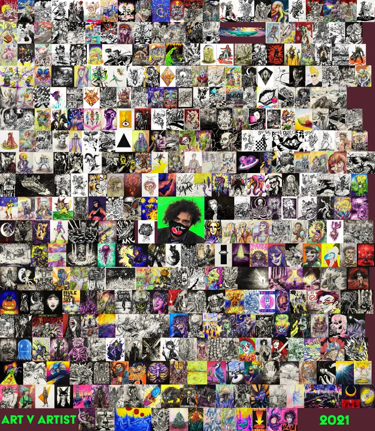
IT ONLY TOOK 365 DAYS


iu_514134_2960153.webp


Hello, on December 31st I wrapped up a daily art challenge where I did at least one full drawing every day of 2021, and streamed the process on my twitch. I'm going to share some of my thoughts on the journey in this news post, they're gonna be a bit disjointed and maybe contradictory at times, but you know, that's part of the fun.


To start I figure I'll explain the "why?" and give a brief overview of the year.

2019 and 2020 were my two least productive years in terms of art. The pandemic did not help matters, but it wasn't the main cause. I would get home from the day job, and sit around watching stupid shit I didn't care about on Youtube; and wait for inspiration to strike when I should have been getting to work drawing.

So on January 1st, 2021 I woke up and did my first stream with the intent to see how far I could get, after considering streaming more art after I did like half of inktober 2020 on my twitch.

A week of dailies went by, then a month, then two, then I hit 100 days and at that point I was locked in.

Full disclosure: there were twelve or so days last year that my internet was down, so there was no stream, but I still drew those days and posted the art.

The last three months were the hardest as I was working close to full time and doing the streams while trying to fit going out and seeing friends and family as well since everyone I knew was vaccinated and the world was opening up again. It all ended up working out despite being utterly exhausted by Christmas time


To any artists considering something like this: I do not recommend it. It isn't a good or sustainable practice to try and do a full original composition every day; the quality of some of my pieces are a testament to that. There were quite a few strings of days where I was just drawing to fulfill the challenge, and they just look blah. There were days when I got home past midnight and set up to do a thirty minute stream so I could pass out immediately after uploading.

Drawing or sketching every day is great, but being beholden to do so arbitrarily is not so great.

The flipside of this is that there is now a ton of art that I have done, which would have never existed if I didn't do this. I have concepts and compositions that I'm definitely going to be returning to in the future, whether it's to expand, redo or rework. I used techniques and color choices that I normally do not use and I experimented a lot with materials, which is a ton of fun having the freedom of knowing if it didn't work I'd have tomorrow's stream to try something that might.


One of the biggest skills I learned is to know when something is just not working early on; and more importantly to stop working on it and find another approach, or work on something completely different.

One regret I do have is that I didn't really have much time for studies, and had initially intended to do gesture drawing and portrait practice in March, when I thought by that point I would be done posting finished pieces. But I just kept pushing myself to finish the pieces and never got around to doing the learning streams. Overall those would have been more valuable than continuing to draw in my usual current style, but we all make choices I suppose. I have been asked by a few artist friends if I feel like i've improved significantly, I have to answer "not really" or "yes, but in the process rather than raw technical skill." I guess it boils down to "there are more productive ways to spend a year doing art, than just doing a punch of pieces." --But again I have to stress I did get a lot out of it in the mindset and adjustments to the process.

Even though there were days that I really didn't want to hop on and stream art, I'm glad I did, it was a lot of fun and having the chat there definitely kept me just engaged enough to not completely lose it. So if you ever dropped in the Stream, Commented on my Art Portal submissions, bought a piece, subscribed, said hi, or whatever else, thank you so much! It's super appreciated and I hope to produce a decent amount of art this year despite not going for 365.


I will be resuming the art stream (twitch.tv/sourcherryjack) later this week or next week. First stream back I'm going to go back and look through all the art and review them, what I like, what I don't like so much, what I remember about them etc. My first art stream back will be an ART FORUM ART WHORE stream where I will be drawing your requests from the thread I make in the art forum. Here is my last art whore thread

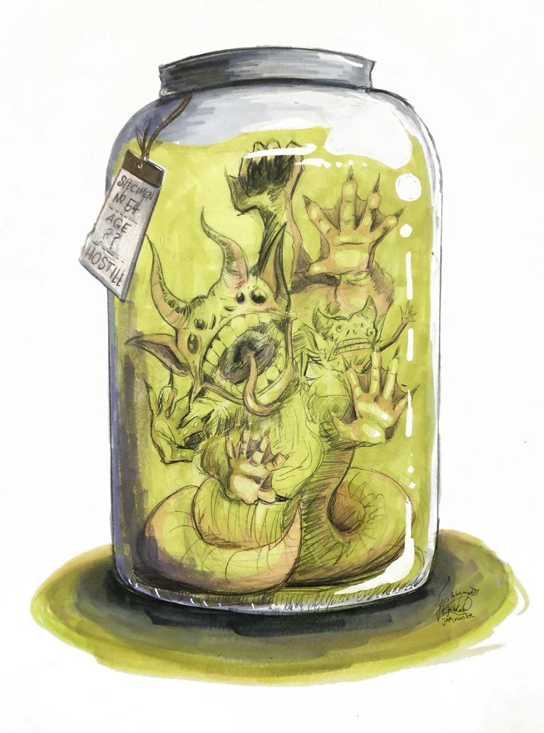
FAVORITE PIECE OF THE YEAR

JAR MONSTER


iu_514135_2960153.webp


Tags:

14

Posted by SourCherryJack - July 5th, 2021


Hey everybody, as of July 2nd I've reached the half a year milestone of daily art!

This is pretty huge, and I've managed to stream almost all of them over at my twitch, save for a few days here and there where my internet was down.

Beyond that, my Etsy Store is up with a few originals, a few recreations and a button pack! Prints are coming soon!


I've got a lot of big plans on the horizon, along with the daily art updates for the remaining half of the year, there will be a lot of Papier-mâché in the coming months as I prepare for Halloween, and maybe - just maybe - some animation.


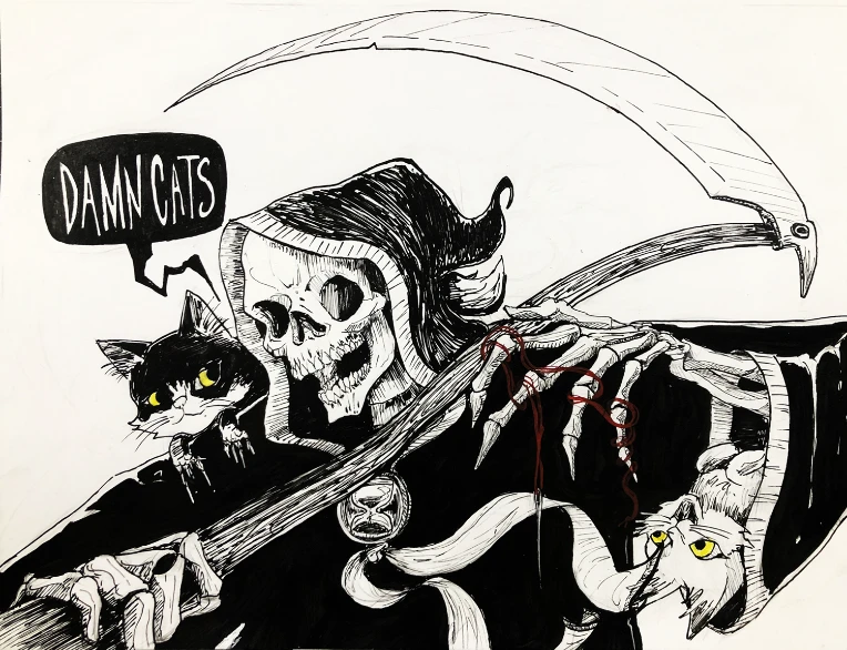
Thanks for checking in, here are a few of my personal favorites from the past year so far:

Day 49: Damn Cats, a return to an older concept of grim reaper and cats. Conker says wussupiu_349453_2960153.webp


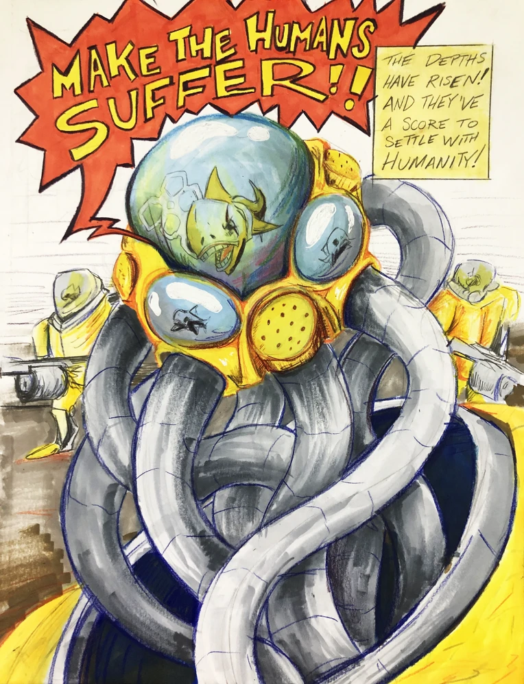
From Day 84: Attack of the Feesh, marker piece where I tried using colors I rarely useiu_349454_2960153.webp


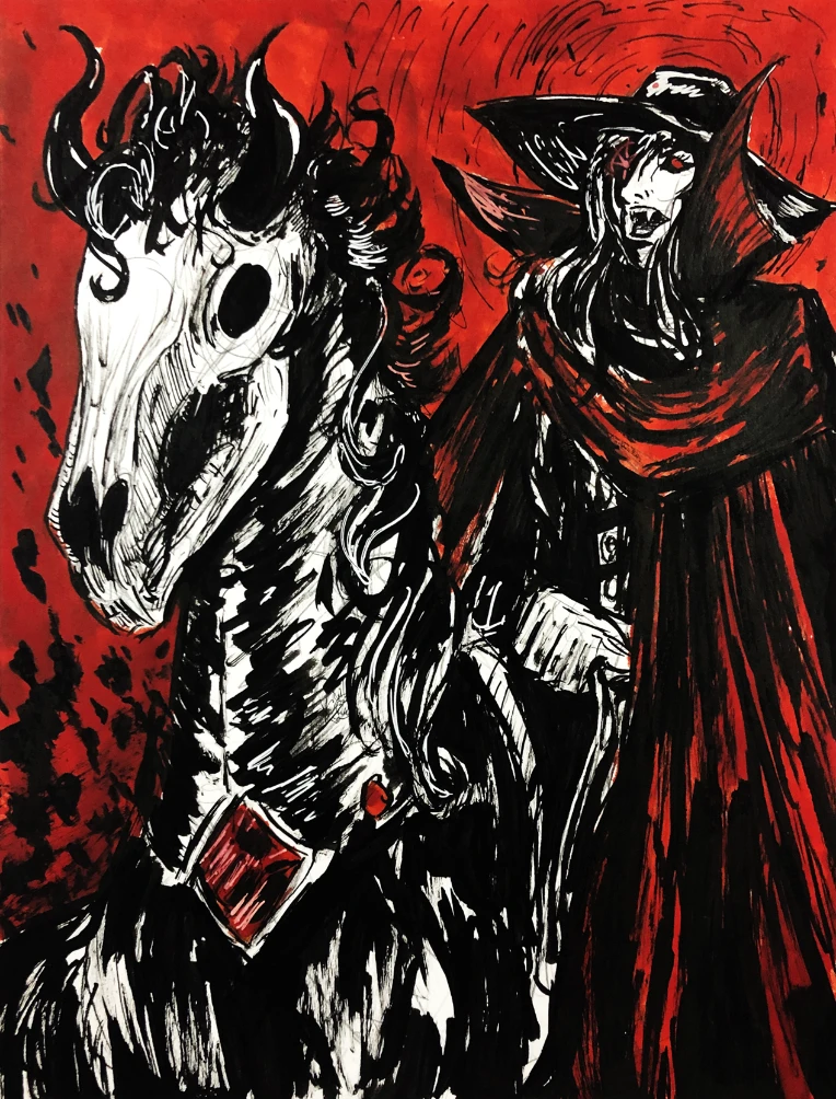
From Day 112 Legally Distinct from Vampire Hunter D. Was a quick one, but it really ended up working out.

iu_349455_2960153.webp


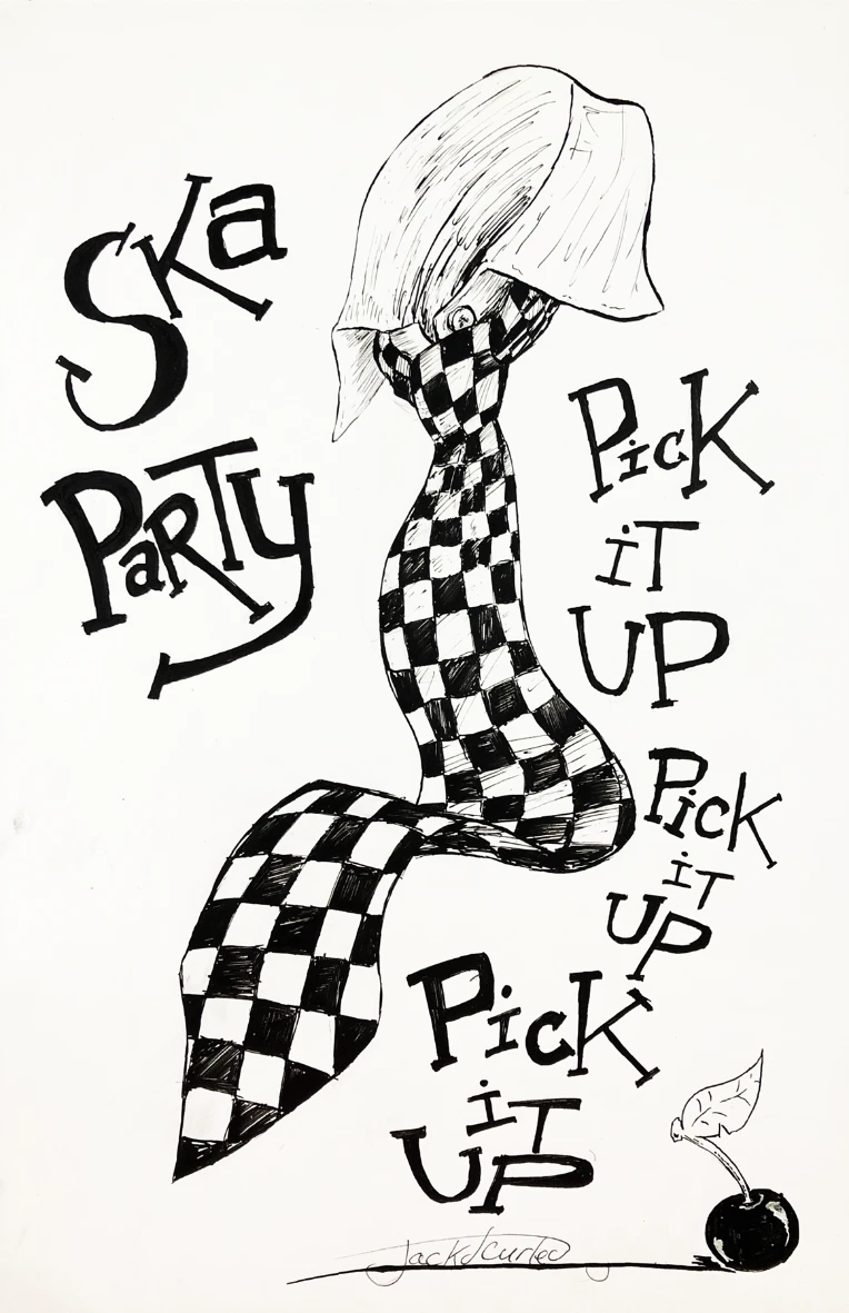
From Day 140 Ska Party Promo, Just worked out as a concept.

iu_349456_2960153.webp


Alright Catch you guys later!


8

Posted by SourCherryJack - February 17th, 2021


Hello, I am currently approaching 50 days of my 2021 daily art streams over on twitch.tv/sourcherryjack . I'm planning on doing a giveaway this Saturday for my subs on twitch, in honor of 50 days in a row, if you're interested go subscribe on my twitch and I'll throw your name in the raffle.

iu_243077_2960153.jpg


Here's the first giveaway I did for last month as part of a collaboration when I was hosted on my friend's stream. I definitely try to go all out on all of these, so if you're interested in potentially getting an original piece from me for the cost of a twitch sub, jump in!

iu_243078_2960153.jpg


Plug aside, here are some of my favorite drawings from the past 47 days on stream.


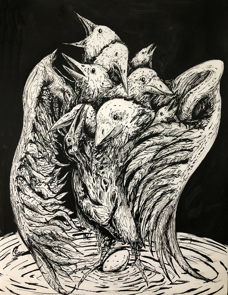
That Wretched Bird

iu_243079_2960153.jpg


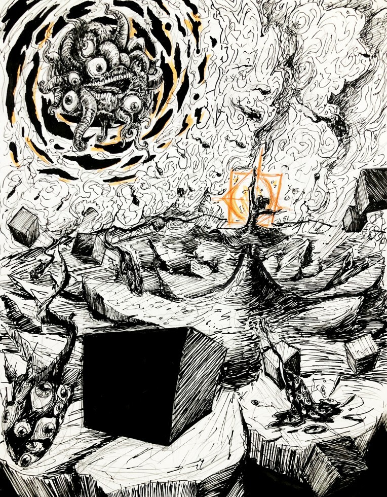
Seeking Communion

iu_243080_2960153.jpg


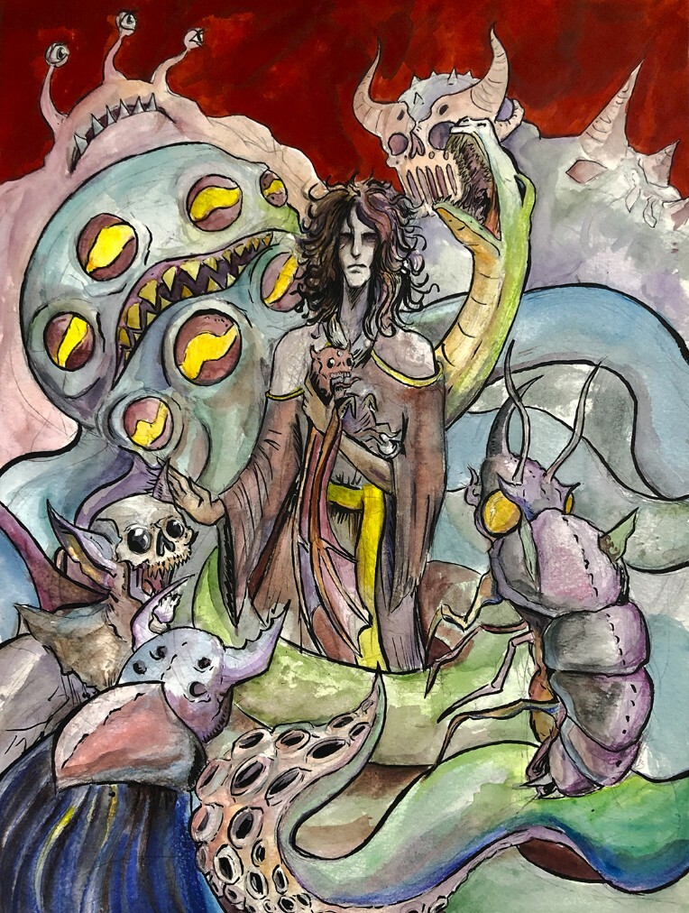
Mother of Monsters

iu_243081_2960153.jpg


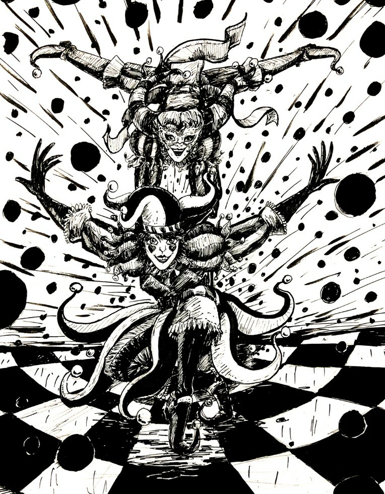
January Jesters

iu_243082_2960153.jpg


DreamPop Canyon

iu_243084_2960153.jpg


Bafloonery

iu_243083_2960153.jpg


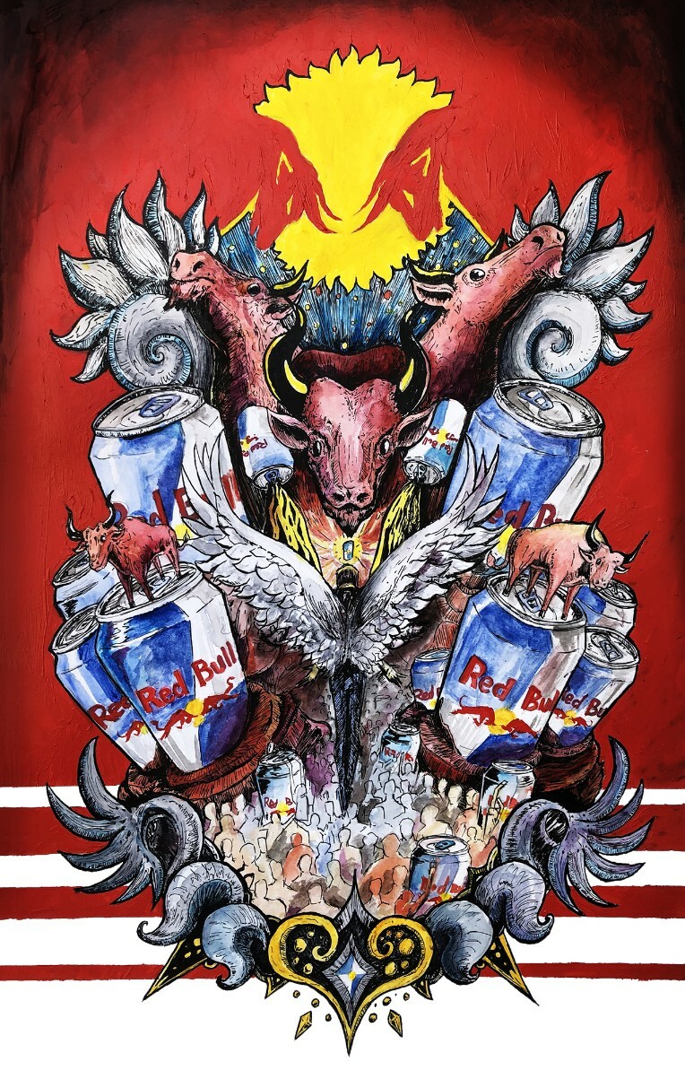
Communion With the Crimson Bovine

iu_243085_2960153.jpg


Tags:

2

Posted by SourCherryJack - January 3rd, 2021


Hey everybody, been a little while since I've made a news post. This year I'm going to try to be doing daily art streams over on twitch.tv/sourcherryjack I'm mostly going to be doing traditional art like ink, watercolor, colored pencil, I'll definitely be having a few paintings in acrylic and oil; and am going to try to dedicate a few days to getting more comfortable with digital painting.

It's a pretty chill time, feel free to drop in and say hi, or drop a request in the chat.


Here are the past two days drawings:

iu_219575_2960153.jpg

iu_219576_2960153.jpg


1

Posted by SourCherryJack - July 2nd, 2020


The Art Portal has had a noticeable uptick in artists being scouted with traced art, and filtered photos in their galleries. Collage and use of pictures in art isn't necessarily a bad thing, but it must be transformative and recontextualized in some way. I'm gonna use this post to clear up some uncertainty in what constitutes a heavily referenced drawing from a traced drawing; as well as what constitutes a transformative work from one that is just using images you don't own and calling it your art.


Tracing

In the event that a submitted drawing is a one to one match with an existing image in its silhouette, and major details, it is traced. If I can stick it in photoshop and put a transparent image over it and all of the lines up perfectly, it is traced, there's no argument, the submission will be deleted, and there's a good chance the uploader will be unscouted from the Art Portal.

How can we tell?

There are a variety of red flags that arouse suspicion from Art Mods, one is post history. If a week ago the rest of a user's submissions had wonky proportions, no grasp of the fundamentals of art: spacial awareness color theory, anatomy, balance etc, and then suddenly they make a wild jump in quality and artistic knowledge; there's a good chance there is some funny business going on. An extension of this is if a user comes out of nowhere, with no icon and a bunch of professional grade looking art all uploaded in a short span of time.

Another red flag is if the technique appears automated; posterize tools and live trace tools in art programs create a very specific type of geometry in the way it breaks up colors and shadows, that artists, frankly, are not likely to do, it's not impossible that a person did it, but unlikely.

The last and possibly most significant is user history. If a user has a past of stealing art, or tracing, we're a lot more likely to believe its happening again and less likely to give the benefit of the doubt.

These are the main red flags we look for, then from those suspicions we go to google images and keyword search to see what comes up.

Don't trace, and don't use filters or art program tools that are basically tracing.


References

Using references is great and an absolutely necessary tool for any artist to be successful in learning to draw something. I strongly recommend every artist use references in their work and studies. Chances are most use of references, unless you are overlaying to get the broad strokes (still tracing), won't be a problem in the portal. But the best way to use a reference is to look at the example image and try to draw what you see as close as possible while using artistic license to fit what you want into your composition. If you're drawing a character like darth vader for example, use posemaniacs, or another more generic body reference and then work out from there and add the armor to the blank body you've drawn. This way you have a completely original darth vader with no question that its your's.

References are good, use them, but don't trace them, learn from them.


If you end up super close to your reference, you might also want to link your reference in the description, art mods are people too, and if we spend ten minutes hunting through google images trying to find your reference piece to check if it is traced we might be in a bad mood and make the call that it is too close and mark it as traced. Being straight forward does go a long way (for me personally at least).


Filters and Collage

This is probably the grayest area, but even then there are some clear lines.


  • Don't use images that you do not have the rights to, stick to photos you've taken, and photos clearly in the public domain
  • Don't just post a filtered image, that is not significantly altered, and it is just photography
  • The photograph should be a relatively small component of the piece as a whole, a sunset with a little stick man drawn on the floor isn't gonna cut it.


So what use of photographs are allowed?

In short; significantly altered photos. This can extend to painting scenes over photos in a way that is clearly distinct, photoshopping more trees into an orchard isn't what we're talking about, maybe inking black and white fantastical trees or trolls or something like that would be cool though.

Cutting out scraps and collage making on painted backgrounds is alright. (@yurgenburgen is a great example of how to transform and recontextualize photos in a way that suits the Portal)

Another acceptable way to transform, I forgot the user, but a while ago in the art forum an artist used an image of a Sea Doo and cut it up in photoshop and created a mech from the cut up image.

These are what we mean by transformative uses of photography.


Filtered photographs as backgrounds in general is tricky game to play and its acceptance is a bit sketchy all around, the way I personally police it is if the background pulls away significantly from the original work on display, it is not okay to use in the portal. What that means by its nature is so vague and difficult to explain, I understand it can be frustrating, but that's the nature of the beast, there's no clean answer to this and it is overall better for the drawing if the artist draws their own background.

To try and explain this: If you have a picture of a mountain range in the far off horizon of a drawing with a foreground and middle ground you yourself drew that's probably alright, but again, its sketchy and other mods can have different approaches. Character drawings with a heavily filtered background might also get a pass, but again, it brings down the quality as a whole and you're better off drawing your own background. It's a case by case basis, and again, sorry no clean answer here.


I can't speak for all of the art mods, but this is how I moderate the portal when it comes to traces/references/photomanipulations.

If you feel your work has been unfairly deleted for any reason you can pm me and I can probably give you a reason why, or failing that, find out from the mod who did delete it why.

We aren't here to punish people or crush hopes and dreams, we're just trying to keep the work in the art portal original, as intended.


1

Posted by SourCherryJack - December 28th, 2018


Just kidding.

I'm gonna keep posting art. See you in the future. 

Carry on. 


4